
On your daily commute to work on Melbourne’s bustling public transport system, take a look to notice how many people are tapping away at their phones. It’s likely they’re contributing to the billions of searches conducted on Google each and every second. And for businesses that aren’t quite mobile-ready, this is a huge opportunity lost. The time to make the change is now, as Google continues to move towards a model that favours portable devices over traditional desktop and laptop computers.
What is mobile-first indexing?
Mobile-first indexing is the model Google uses to index and rank all sites, after decades of favouring desktop formats. This indexing will measure your site's relevance to searches and rank your site accordingly for users looking for businesses in your industry.
The reasons behind this change are simple: more people are consuming information from the internet on their phones, over sitting at a desktop. For instance, in Australia, there are almost 17 million smartphone users – a staggering volume considering our population sits around 24.6 million.
Domestically, we are actually railing against a global movement away from desktop computers. But only 1.16 million units were sold in 2017, which shows how many more people are using smartphones and other devices as alternatives.
Furthermore, the Australian Bureau of Statistics figures from 2018 shows that desktop computer smartphone usage have achieved parity, with 91 percent of connected households using both.
These figures are expected to turn in the coming years with the majority of connected devices being smartphones, rather than even turning to their computers at all.
So, with that in mind, here’s why it’s time to make the switch to a mobile-optimised site sooner rather than later:
It can help you increase sales
With more people using smartphones to browse the internet, they’re also using their phones to shop online. In 2015, less than 10 percent of Australians used their mobile phone to make an online purchase. In 2017, one in five transactions were made from these devices.
This increased again by 26 percent from 2017 to 2018, showing that more and more people are adopting mobile phones as a way to purchase goods and services. Apps and services like Afterpay have made it even easier for consumers to adopt this behaviour, as well.
Beyond that, younger people are more likely to purchase online than older generations, with those aged between 18-24 and 25-34 up to 78 percent more likely to buy products and services using their smartphone.
The upward trend of these figures highlights that moving to a mobile first mentality with web design and management is only going to benefit the businesses that embrace it.
Mobile-first indexing will help you improve and maintain your rankings
The good news for those who only have desktop versions of their website is that Google will not exclude them from rankings. If there is no mobile responsive version to be indexed, the desktop version will be indexed instead.
The bad news is that these desktop indexed sites will be ranked lower than the mobile versions. To compete with other businesses in your industry, a well-populated and managed mobile version of your website is crucial to stay relevant.
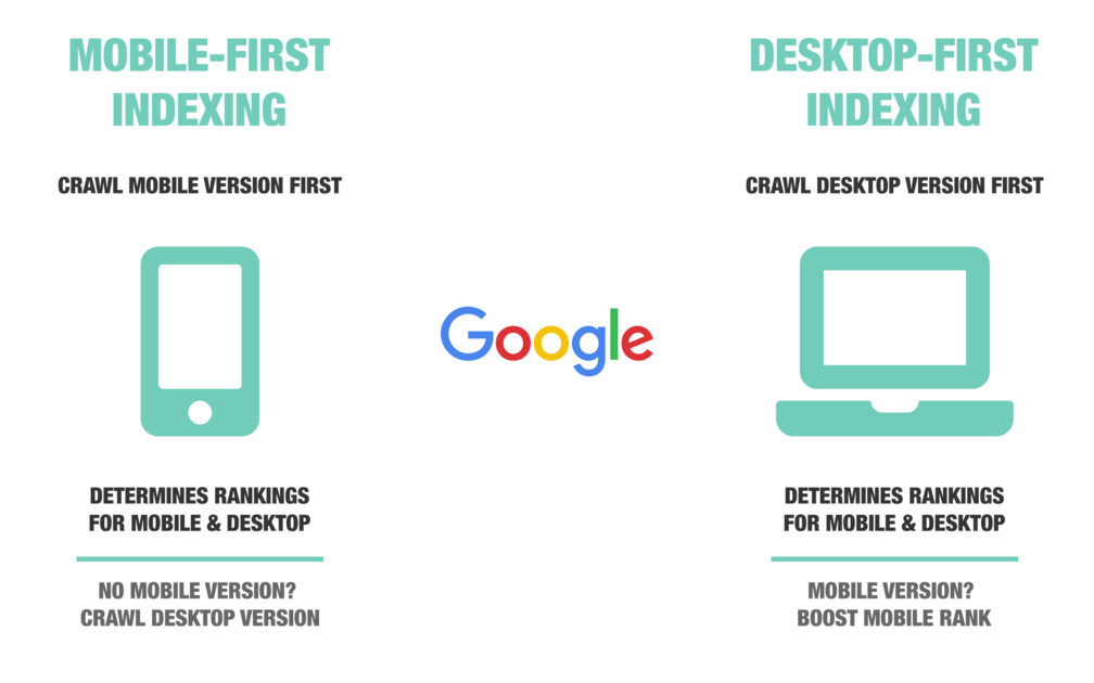
How the Google bots work your choice between mobile or desktop.
If your desktop site has been performing well in the past in Google rankings, doing the same with your mobile site is likely to reap the same rewards. But enhancing the mobile experience for your customers, current and potential, can see you boost your rankings even further.
If you are one of the first in your industry to port all of your content over to your mobile site, you are going to be prioritised over other businesses that may lag in doing this.This presents an opportunity to rocket up the Google ladder.
Provide the best experience for your customers
Above all, it’s still important to remember that consumers on their smartphones behave very differently to those using a desktop. Because of this, they expect a different experience; your design should be completely tailored and navigable for these devices.
Your mobile website should be unique to your desktop version, while still keeping the same tone and branding so people can clearly identify your business. Content can be housed in drop-down menus and other features, giving consumers easy access to it without having it all housed on a complicated home screen, or giving them unnecessary reason to scroll endlessly.
How Google is making the transition
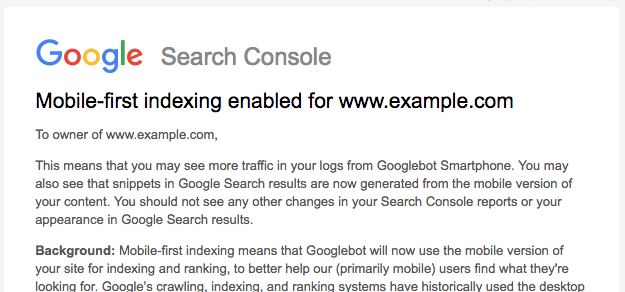
Mobile-first indexing is effectively an option that has been introduced by Google that will make the mobile version of your website the prioritised one.
The Google crawlers or spiders (whichever creepy way you want to refer to their searching bots) will progressively be favouring websites that have selected this option, mostly because mobile phones are the way the majority of people are using the internet.
This shift began back in 2016 and mobile-first indexing is now used for over half the web pages in its search results.
How you can improve your mobile first indexing right now
The good news is that penalties for websites that have a desktop computer focus won't be meted out instantly. It’s going to be a slow process, so that everyone’s given plenty of time to adapt and adjust their web operations.
In the meantime, you can start to make the transition through the following methods:
- Build out the content for your mobile site: Many sites have more content on their desktop version than their mobile version. This is largely because of screen size and a perception that less is more on mobile. All of your content should be on both versions, so start shifting that content over now. In the future, new content should be applied to both desktop and mobile versions of your site and ultimately it could reach the point that no new content is required for desktop versions.
- Ensure your mobile site has metadata: Like content, metadata has been previously ignored for mobile site. Ensure all current and new content has updated metadata for Google to read.
- Speed up your website: Consumers using mobile devices want information fast and have even less tolerance for lagging sites than desktop users. There is software and apps available that can strip down your HTML and optimise your pages to run like lightning on smartphones. Investigate these options or speak to a web designer (like us) about how you can provide a better customer experience through faster mobile interactions.
- Maximise the use of menus: Google knows that there is precious little space on a mobile phone screen, even the big ones. So, it is not punishing websites for hiding content behind drop-down menus and accordions to maximise the use of this space.
- Kill flash: We are not in the 1990s anymore and Flash is not cool. Apple has done away with it altogether, so iPhone users aren't even going to see your Flash components at all. Move with the times and get rid of it forever.
- Manage your popups: We know they are necessary for lead generation, but they can also be highly annoying to mobile users. Ensure that they can be easily managed and closed down or frustrated users will turn away.
- Don't panic: If you have already moved towards a mobile-friendly model that prioritises this form of your website, you don't really have to do anything new at all.
Engage professionals for the best transition to mobile indexing
For those that don’t have a mobile version of their website, or they have one that contains little content, the transition will require a lot of work. Not only will the data need to be ported across, web design will need to come into play to ensure the mobile site is optimised, fast and uncluttered for a positive user experience.
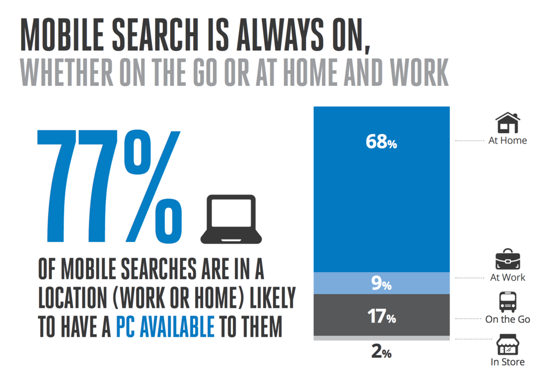
Image source: NeilPatel.com
Enlisting professional web designers for this task can save you hours of work in making the transition and have your mobile optimised site ready long before your opposition has theirs ready.
If your mobile website has been neglected or ignored to this point, enlist the help of our experts for a quality result that will tick all the boxes that Google’s little spiders are looking for. Call us now on 1300 367 009 to get started.