A flashy logo, a dazzling banner, and a few working links - that’s all you need right? Mission complete.
Sure, a website that functions will get you here and there, but a platform that works like a well-oiled machine will power your business up in ways that are tangible, passive and unsurpassed. Ideally, a website that’s designed with the end-customer in mind is one that reflects the target audience’s needs, desires, behaviours and mentality. But how do you incorporate all of that into a design that still looks the part of a reputable company?
Easy - you ensure you’ve got an understanding of what an online business should look like in the first place.
The need for a tailored, interactive approach
Gone are the days where a 1997 look and feel did the job for a website. The flashing Comic Sans text and a few hyperlinks jumbled all over the place was good enough.
Back in those days, it was a much simpler time. These days, consumer behaviour demands that user experiences (UX) are far more advanced. You can’t expect to convert on a website that looks about as basic as the internet did way back when.
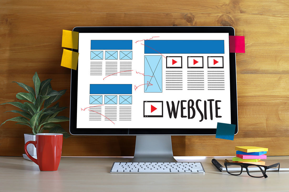
Designers are now faced with the challenge of ensuring websites run as full-suite platforms. They must be interactive, responsive, able to go from one device to another in an instant; they need to look the part and act the way the user wants them too. And that’s tricky business. But the first step to acknowledging what a good corporate website looks like is getting clued in about just how important an interactive approach is when building a site. What are your customers expecting when they arrive on your page? How will they act, and beyond that, have you tailored the platform enough to suit their individual needs?
That buzz word again: ‘mobile-responsiveness’
Get used to it. You’re going to hear it a lot. The mobile-first age means search giants like Google prioritise mobile-responsive websites over those that aren’t, in search results rankings. If your users have to scroll endlessly or zoom in and zoom out, just to get the information they’re after, then you’ve got it all wrong. And this is a big mistake to make.
It’s absolutely critical to consider how consumers search for their content on the go. Those that visit your website are likely not on a desktop anymore, and data like that on Google Analytics can provide further proof to that. If you’re not embracing this, you’re ignoring their behaviour...which is something that will cost you in the long-run.
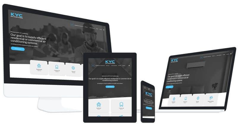
A mobile-responsive website automatically adapts to the device the user is viewing the page from. At their fingertips, they can navigate their way through the site, with each loading page already adapted to fit the screen in front of them. Beyond that, the page times are fast, quick to show up in front of them and lets them get the information they want instantly. There’s nothing more annoying than having to squint at a tiny screen to see the little text at the footer of a page - help your viewers out; give them a mobile-ready experience.
Less is more: minimalism
You’re not a signboard in Las Vegas - you don’t need all the bells and whistles to pull attention. What works better is having a clean, user-friendly web design that draws eyes to all the right places. Instead of cluttering your layouts, strip it back to create a simplistic, flowing design that shows your visitors how to guide themselves through the sales cycle of your page, not abandon it.
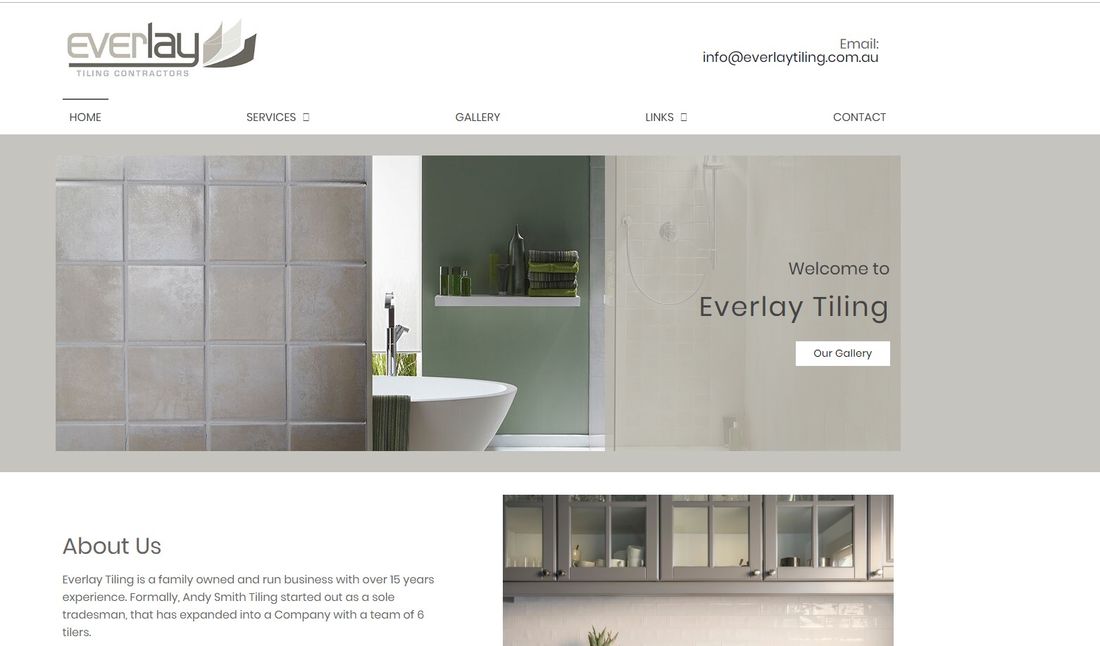
An example of one of our minimalist designs: Everlay Tiling
If visitors can’t find the phone number for your business among all the jumbled text, or the menus don’t clearly define where they need to head to next, it’s time to reconsider how your design is helping your bottom line. Think of your website as a tour guide to your business - how is it showing your leads what to do next? A minimalistic design is key to that.
Pro tip: Your homepage should be the most minimalistic of all. Keep it free from clutter and visually appealing to hit the nail on the head for your first impression.
Get visual
No one likes to read endless amounts of text. Breaking up slabs of words with powerful, engaging graphics can keep your visitors on the site, and allow them to consume your information more carefully.
If you’re a company that relies on complex information, incorporating high-quality graphics to accompany website content can help guide users through the experience of understanding what it is you do, how you can help, and how they can convert.
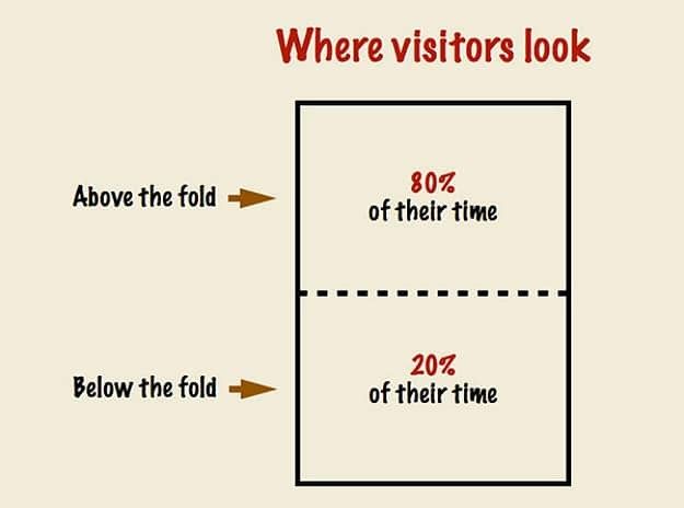
But beyond just graphics, it’s important to keep visual hierarchy in mind when designing your layout. Consumers don’t have more than a few seconds of attention to spend on your page, so you have to be quick-smart about reeling them in. Put your most important information and images above the fold of your page, and work your way down the layout with the least critical details last. Don't’ leave your primary messages to the footer of your site - that’s a big no-no.
Content is king
It’s an overused phrase but for very good reason. Content’s role in a good website design is paramount: you inform users, you entice them, you have them coming back...if you play the content game right. Beyond that, the content you create should be 100% unique, optimised for your SEO goals and personalised for your business. There’s no use copy and pasting from someone else’s platform - stay well away from cutting corners.
Think of your content as a kind of business card. If you can pitch what you do in a natural, informative and supportive way, what would you say? Carefully consider the sales funnel of your website, your business model and how your users are likely to convert, then establish content pillars to suit. Spend the time and energy into a proper content strategy and you’ll reap the benefits of passive leads time and time again.
Keep up with the trends
Just like fashion, web designs go in and out of being on-trend. So it pays to keep up with what the latest looks are and what users are craving. While minimalistic designs are still all the rage - and have been for a few years now - flat icons, portfolio layouts and other elements also pop in and out of popularity. The best way to keep on top of these changes is to keep tabs on your own inspiration - what are you seeing others do that looks good, and how are their users reacting to it?
Ready to give your company’s website a bit of a renovation? Contact a Website Design expert on 1300 367 009.