In front of every strong business or brand stands a strong logo design. A strong logo is instantly recognisable to a wide audience base and conveys all the messages, values and sentiments that the business wants its audience – current and potential – to know about.
They seem simple, and they often are. A basic image and maybe a word or two, emphasised with a splash of colour, or two if the company is feeling adventurous. Despite their simple appearance, there is a lot of work that goes into designing a logo that will successfully do its job.
Here are some tips for you on how to make your logo communicate your brand and why it is important that your logo is strong and memorable. The strength of your logo could mean the difference between being at the top or bottom of your industry.
The psychology of fonts
If you are going to use words or lettering in your logo, choosing the right font is about more than just design. First of all, bin any thoughts about using Comic Sans. Delete that font and then delete it again. Why? Because this font has become symbolic for lazy design and is viewed as childish and an obvious nod that you have used a basic Microsoft program to create your design so please get a professional for your design.
Fonts are more than just styled letters. They each have their own triggers that set off different parts of the human mind. There has actually been a study into how we perceive meaning through fonts, conducted by the Software Usability Research Laboratory (SURL) at Wichita State University. The study found that traditional fonts like Times New Roman and Arial were viewed as mature and responsible, but also boring and lacking imagination.
Think about what emotions you want your brand to inspire, then look through the fonts and see if any of them ignite those emotions in yourself. Picking the right font is a critical choice and can successfully communicate what your brand means to your audience.
The psychology of colours
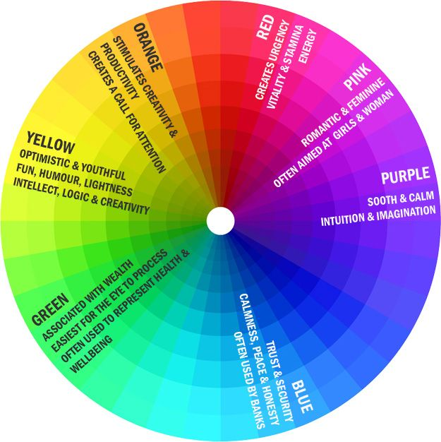
The colours you choose for your logo are just as critical. Each colour tends to inspire different feelings in people and will go a long way towards setting the tone for your brand.
For example, red is vibrant and energetic but can also signify danger or urgency. Blue is a
calmer colour, tranquil and professional. Green can be associated with natural or organic products. Pink is more of a fun colour, a bit more bold and brash. White signifies purity, while black signifies power.
So, a law firm is unlikely to use pink as their primary logo colour, while a natural or vegan product would do well to stick with greens, browns and more earthy tones. Have a think about what you want your brand to say and research the psychology behind each colour to land on the ones that best suit your business.
Choosing the right shapes
Shapes are like fonts and colours as they portray different messages. Geometric shapes are squares, rectangles, triangles and other straight-lined shapes. These shapes tend to convey a sense of order, power, strength and reliability. Triangles can also be used to portray direction. Stars have always been a symbol of fame and the entertainment industry.
Shapes with curved lines are softer and have a sense of grace about them. Circles and ovals have a feeling of timelessness and harmony or may represent a cycle. Hearts, whether they are broken or unbroken, are always affiliated with love and love lost respectively.
Your business might not want to convey order, power, harmony or grace though. In this case, abstract shapes might be the way to go. These shapes are becoming more and more popular to represent businesses with out-of-the-box ideas, products and services.
Either way, the shapes you choose in your logo are often the first thing that will catch a person’s eye. Choosing the right shapes can ensure that you are capturing the right audience.
Nifty design tips for your logo
When it comes to the actual design of your logo, here are some tips to follow to help you create the best possible product for your brand.
- Keep it simple: Don’t over complicate your logo with too many elements, colours, fonts or design features. They are meant to be clean and concise, deliver your message and be easy to remember.
- Avoid design trends and bandwagons: It can be easy to monitor current trends that are working for other businesses. But by locking onto a trend, you are sacrificing your own brand's individuality and running the risk of this trend growing tired, stale and cliched.
- Be unique: Your logo is meant to portray your brand, so create something truly unique that you can own. Think about some of the big brands – they don’t just state the obvious. Ferrari doesn’t use a car, and Nike doesn’t use a shoe.
- Capture your brand: The imagery in your logo needs to capture the spirit and essence of your business. A good way to workshop this is with a mood board. Select a range of images that portray your brand and understand how they make you feel. This will help you lock in the right image for your brand.
- Consider a ‘name-only’ logo: Is your brand name catchy, punchy and short? If so, there might be merit in using your name as your logo. Use a tailor-made font and add design elements to catch the eye. Think Coca Cola or IBM for examples of this.
- Make sure it looks good in black and white: Your logo is going to be used across a wide variety of mediums and digital platforms. Colour is not always the appropriate option, so ensure your logo is striking in both black and white.
- Try the visual double entendre: This is basically an image that can be two different things. This allows you to represent two different messages in your logo with one clever picture.
- Develop a strong tagline: Although you want your logo to convey your business and what it does, it always helps to have a strong three to seven-word tagline that goes with it. This can further strengthen your brand and solidify your values.
- Does your logo fulfil its mission? Ask yourself this question when you are looking at prototype designs. If the answer is no, or even just maybe, then it is not right. Don’t settle for a logo until you are 100 percent happy that it represents the message you want your brand to convey.
The importance of logo placement
Once you have settled on the perfect logo, the question is now where you should place it for maximum effectiveness? Nike, for example, plasters their iconic swoosh logo on any major athlete they can because they want to be known as the sportswear brand chosen by the very best. To begin with, your logo will be placed in the obvious spots like on your website, your lettering, your emails, your vehicles, your business cards, your social media, your products and your advertising.

Serena Williams sporting the iconic Nike tick. Image source: IOL
But try to think outside of the box a little bit. Blanket advertising can burn your logo into people’s minds but positioning your logo in relevant scenarios is more likely to make them take action. Think of events or products that also tie into your brand and try to get your logo seen there as well. For example, a stationary company should have their products laden with their logo, while an organic food company can find value in plastering their logo around market events and natural food stalls.
The best and most iconic brand logos
The key to success with a brand logo is for people to instantly recognise your business, what you do and the product that you deliver – all without once seeing your company name.
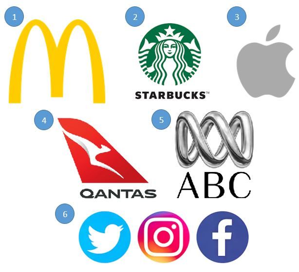
Here are some of the most recognisable and successful logos around today:
- McDonald's: There is very little we can say here about the famous golden arches that you don’t already know.
- Starbucks: Australia has its own highly recognisable coffee shops, like Gloria Jeans and Zarraffa's. Despite these coffee shops outnumbering the American chain Starbucks in a big way, consumers are still able to recognise the lady in the crown from their logo instantly.
- Apple: This company has the distinct advantage of standing out in the major fields of electronics, computers, tablets and mobile phones. While PC and Android devices have a range of companies competing for market space, Apple was able to create its own market, its distinct logo separating it from the rest.
- Qantas: On the domestic front, our national airline has managed to secure an iconic status with its famous flying kangaroo. They’ve recently renovated it for a sleeker, curveier look.
- ABC television: Like the national airline, the national broadcaster has a logo that is immediately recognisable by all Australians, affectionately known as ‘the worm.’
- Social media: We could single one out, but we will outline a few as the big players have all been largely successful. Blue is a common colour and is used for both Facebook and Twitter; one uses a single letter and the other a simple picture of a bird – harking back to the old days of sending short messages using a literal carrier pigeon. Meanwhile, Instagram’s simple use of a camera icon conveys the message perfectly, while YouTube does the same thing with the play button icon that is also used on all of their videos.